As a group we visited www.dafont.com which is a website which has a number of fonts that you can download. We decided that these fonts are the ones we are going to pick our final font out of. They all relate to the grime genre and are all good and suitable in their own ways.
Tuesday, 14 December 2010
Our CD Digipack draft

When we was designing out CD Digipack, we came up with a number of ideas to use and ideas of where we can take our photos. For example the picture of London city in the top right corner is going to stretch over to two panels and be a long photo which we are going to take. When we film our footage in London we are going to take a number of pictures and see what one we believe suits best. Also we used the computer to find a suitable font which related to our genre. We thought that this font we used for our track list suited the grime genre. We have pictures of our band sitting on the wall, with our main performer who is Casey McCabe standing out in the picture as he is sitting down and we can see his whole body compared to just me and Nathan's face. The other picture of us in the bottom right panel was our main idea for our front cover. This shows us as a band in the main part of the picture as we are in the middle. As we had a black and white printer we could not make this how we intended as we are going to have us 3 as a band in colour, and the rest of the picture black and white so we stand out. This picture is going to be taken in waterloo station and we are going to take it again as this picture is done as an edit on photoshop.
Friday, 10 December 2010
Camera:
- Panning around the house to show how the members if the group live
- Shows the audience the groups lifestyle
- Actions show how they enjoy themselves
Editing:
- Montage editing
Sound:
- High paced music - goes with crazy dancing and crazy lifestyle
- Several artists sing - shows they are a group
Mise-en-scene:
- Bright colours represents that the group are enjoying themselves and enjoying their successful lifestyle.
- costumes are mainly bright colours - again goes with happy successful lifestyle.
Performance:
- Dancing
- Eye contact
- Lip syncing
- Reaching
- Pointing
Tuesday, 7 December 2010
Digipack CD Cover info
A digipack is a little cardboard booklet which holds CD's for a band or an artist but also has photos, pictures and promotion posters inside. They also have all of the songs from the album inside the digipack.
There are certain things that make a digipack effective. For example the digipack should stand out, this can be by using bright colours or by using images and fonts that catch attention. The digipack should also relate to the band or artists genre. This can be by having lots of pictures or images of them performing or together as a band.
What i believe are Good Digipacks

 ``
``
Our final location
As a group we have thought alot about our final location for our music video. As our first idea we chose to go brighton and film our music video by the pier and on the beach. However we do not have access to a car anymore and have come up with a better and a more suitable idea. We have chosen to go to southbank in London and film some of our music video here. The graffiti and the urban surroundings set our music genre and here are some pictures of this:


Tuesday, 30 November 2010
Comparing blogs
LongRoadMediaBlogs.
WWW
- There final piece of their music video's were very good as they included lots of different various shots and included lots of different destinations
- Their blogs have lots of examples included
- They have used a number of music videos which they have analysed
EBI
- A lot of blogs that i have looked at have not included as many pictures or videos as my class have.
- Some music videos start to get boring as they are very simple and repetitive.
- They have also taken screen shots of different website and advertising such as Myspace for the artist to show the artist image. This could help to improve my blog to get more screen shots.
CD Cive

Friday, 19 November 2010
Props and costumes in our group
In our music video, our group decided what kind of clothes we would wear which would suit our genre, and also props that we could use such as trainers and jewelry. We believe that trainers, jeans and designer brands would suit our genre and we took pictures of these as we would wear similar clothes when doing our music video. We have a number of brands which relates to our genre such as lyle and scott, armani, vans, nike, ralph lauren and adidas. We also think that each of us should wear similar style clothing in our music video as we are a grime band all at the same age. So these branded clothes and props would suit our music video. In our music video we will also have shots where we are on our phones. As a lot of young people have blackberry phones and so does everybody in my group, this is a main prop for our music video.
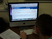
Casey Working on his blog.
Our group storyboarding


Amongst our group, we decided that storyboards would be a good way of planning our music video. Me and Nathan Oliver created the storyboards and we both coloured them in to stand out and look colourful and look like we put in effort as we believed this was an important part of our planning as we would follow this step by step guide of filming. We added in what type of shot this would be, the shot number and dialogue to make it clear for us to read.
Tuesday, 2 November 2010
CD Cover discussion
We used this background of a busy train station because we believe that this suits our band genre which is kind of urban. As we are walking up the stairs we are seperated from other people as we are the band and the main highlight of the picture.

This was our first idea of our editing for the CD Cover, however we had a few more ideas as to where each person in the band would be placed in the picture.We then came up with our final idea, which was edited on photoshop by Casey. 
Final Picture:

Monday, 1 November 2010
West Papua
WE MEDIA
http://www.channel4.com/news/probe-launched-into-west-papua-torture-video
in this clip from west Papua WE Media is shown through a number of different ways. For example the clip from channel 4 shows torture for the people from West Papua.
This clip has been recorded by a camera from somebody being at the event and u can see a number of people videoing the footage. This is WE Media as this is then uploaded to the internet for the whole world to see. If there is hundreds of people capturing this footage through their mobile phones or their video camera’s they can all upload them onto the internet and onto various websites, which allows the public to view. This footage is then used by channel 4 to show the UK so we can see what is happening in West Papua. WE Media is used by these footages as the videos spread over different websites and are available for everybody in the world to see due to the media products such as cameras, mobile phones and the internet.
Friday, 22 October 2010
Tuesday, 19 October 2010
3 costume ideas


When i was planning for my music video we was thinking of a number of costumes. For example we had 3 different costume ideas and we was going to pick what we believed was the best costume to use and would be appropriate.
Idea 1 - Baggy black jeans, Hoodie, New era Hat
Idea 2 - Skinny Jeans, t shirt Sunglasses, Converse trainers
Idea 3 - Leather Jacket, Casual Trousers, New era Hat, Sunglasses
Poster idea
Friday, 15 October 2010
Final cut screen shot and video
In this lesson we was asked to perform a song of our choice in small groups. Nathan Oliver and Paul performed a song which is similar to our genre we have chosen. When performing paul and nathan were lip syncing and performing, such as dancing which also relates to our genre. Once we recorded this we uploaded our footage and was shown how to edit this on final cut. We was asked to play around with final cut on the Macs to see what effects we liked the most and select a background for this. Here is an example of what my group achieved in this lesson and here is a short clip from our final piece.

Subscribe to:
Comments (Atom)


