Tuesday 29 March 2011

In what ways does your media product use, develop or challenge forms and conventions of real media products? (Music Video)

When we made our music video we concentrated on plenty of different conventions from real media products. Some of these conventions include:

  • lip syncing has to be in sync

  • The main performer should be wearing more then 2 costumes in the video

  • Have atleast 3 locations

  • Each shot must cut in time with the beat

Also, when we was researching for our music video we took alot of notice in devlins video "london city". This video by the Grime artist was filmed mostly in London, which gave us inspiration and good ideas which we could use in our music video, as it is also a grime track. We used a number of shots in our music video to relate to real media products such as the Devlin video. Some of these shots included Big ben, London eye and London bridge which were in the background of the shot of Casey (the main performer) lip syncing. When we was planning for our music video we decided to film up London as use locations such as the London and Big ben. This was because we want to show the audience that our artist is wealthy and has come through the underground scene and is now at a higher class, emphasises by the album name "millions don't come easy". This shows that MCCabe has become famous and earnt a lot of money, however he had to work hard for it and it has not been an easy journey.


In order for our music video to use all of the conventions we believe that Devlins video "brainwashed" would be a good video to research and evaluate. This was because the music video was low budget and did not have a lot of money spent on it, and some of the effects are easily done on the editing programmes that we use. When we made our music video we related in to real media products, for example when we was filming for our grime video, we had a shot of Casey lip syncing infront of a white wall which had graffiti on it, which related to the genre, which is also signs of a lwo budget video, but it also shows that the video is set in an urban environment which challenges real media products.


Tuesday 15 February 2011

How did you use media technologies in the construction and research, planning and evaluate stages? (Music Video)

Before we started to make our music video we had to research a lot and plan our work carefully. We spent a lot of time thinking about different genres and spent time looking at music videos to get ideas and conventions which we could play with a use effectively in our final music video. We looked at various artists, mainlyto do withhip hop and UK Grime, as this was one of our main interests when researching as this genre of music is what we enjoy. One main artist that we looked at and researched in depth was the UK Grime artist Devlin. This was because lots of his ideas when making his music video were filmed in London which was just a short train journey away from us if we decided to film up there. He also used many effects of the editing programme Final Cut, which we used to edit our music video. We looked at many different music videos on youtube when we was researching our work. Some of the artists included Tinie Tempah,Eminem, Devlin, Giggs and proffessor green.

This is a shot from Devlins video "brainwashed" where final cut has been used to translate a shot of Devlin performing being shown on the buildings in London. As a group we thought that this looked very effective considering it is easy to do, which gave us a similar idea for our music video as it is the same genre.

How did you use media technologies in the construction and research, planning and evaluate stages? (Ancillary Task)

When planning my ancillary task I used media technologies to search for other work in which I can inspire and choose from. For instance I used the internet to search for various digipacks from artists of a similar genre, and posters which were also similar to my artist. I also used to internet to search for previous work that has been done which I can use ideas to put into my final piece. This is good as you can see hwat works well, and what doesn’t work well, and you can then choose to use them or not to use them. When I was planning my work I used another piece of media technology, a digital camera. With this camera I was able to take pictures and still images of different locations which included MC Cabe in the picture and pictures without him. We also used the school music room to take images of Casey in the studio rapping. This is good as it gives u good ideas about hwat looks good in the posters and digipacks and what can be improved. We also used Photoshop which is an excellent editing programme on the Mac computers. With this programme we can edit images in many different ways and add effects that will make your piece of work unique and how you would like it. We used this through out all our tasks and i believe the outcome was very successful.

What have you learned from you audience feedback? (Music Video)

How effective is the combination of your main product and ancillary task?


Wen we was doing our main product (music video) and our ancillary task, we knew that it was important to keep the same theme throughout.
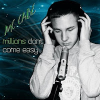
Also when we was making our music video we concentrated on the props and the costumes that Casey was wearing so that it suited the grime genre. In the main product Casey was wearing different costumes but they were all representing the genre. For example he wore tracksuits, jeans, trainers, hats and designer clothing. This shows that he is a young artists earning a lot of money due to his hard work, just like our inspirations that we researched such as Devlin and Tinie Tempah. When we was planning our ancillary task we took pictures of Case (MC Cabe) is various costumes to relate to the genre to put into our digipack which combines with the main product.


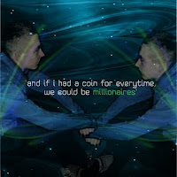
In our ancillary task we also made sure that the theme throughout each side of the digipack was carried on throughout each panel. For instance we downloaded a vector from "brusheezy" which is a useful website for designing and making your work look interesting. The theme that we picked was a black and blue vector which was a exciting pattern, and we used this all over our digipack to give a good effect.
We also used "dafont" which is a good website where you can download cool fonts to match your genre. We believed that once we chose a suitable font we should use this throughout our whole ancillary task.


What have you learned from you audience feedback? (Ancillary task)

From my audience feedback of my ancillary task i have learnt a number of ways in which this dighipack is successfull and good, and a number of ways in which this digipack could be improved. I uploaded the digipack photos to facebook which allowed friends and family to comment on what they thought was good and what could be improved on the digipack. As you can see from the print screens below we good a number of good and bad comments. One thing that i learnt from the comments were that the writing could be a lot more bold and stand out more on the front cover on Casey which millions dont come easy and MC Cabe. These should stand out more and we shoul of made that artists name stand out more, so it is obvious who we are talking about. The pictures got very good comments, for example the main picture of Casey looks professional and is well taken and edited, however the picture of my on the following panel could also be in black and white which would match Caseys picture to give it a good effect and to show continuity throughout the digipack, also this will make the picture stand out even more. "I think this font style, colour and boldness should be used throughout to give the album a recognisable brand" This comment was very helpgul when i was looking at the audience feedback. This was because they writing stood out clearly and if we used this font throughout the whole digipack the other bits of writing would be more recognised. Overall i would say out comments were very helpful for us to improve our digipack if we were to do this again, and one person gave us a rating of 8 out of 10, which is good, but means there is still areas for improvement.